© 2011 Rex Jaeschke. All rights reserved.
[When I first posted this essay, important formatting information was lost. As a result, in a few places I've inserted pictures of the original Word document formatting instead of the actual formatted text. Unfortunately, a few of these don't look very good, but that's the result of posting to this blog site, not on the feature itself.]
These days, everyone's an author, whether it is writing casual emails, letters to friends, papers for school, or proposals for work. Very few people have access to a secretary who, in days gone by, would take one's draft and type it up neatly correcting spelling and grammar mistakes and generally making it look professional along the way.
I have long maintained that form is just as important as content, perhaps even more. The best-written text can be ignored if it is presented poorly. Now while a so-called good-looking document might not be worth reading, people will be more likely actually to read it, at least for a page or two because it is good looking.
In this essay, I'll point out a number of things one can do to make a document more attractive and, therefore, more likely to be read. I have been writing for wide circulation and publication for more than 25 years, and I am completely self-taught in both writing and layout. I can say with complete certainly that I've learned a few things not to do!
Although I now happen to use Microsoft Word (2010 edition) for all my word processing, this essay is not about learning that application or indeed any specific tool. Rather, it's about things that one should be able to do in any modern word processor.
The good news is that popular word processors provide a number of standard document templates and default settings, so one doesn't have to configure everything. These include margins, font type and size, paragraph format, and line spacing, all of which can be overridden, as you need and get more advanced.
One very important thing to understand is that the better looking a document is, the less you will notice its layout. You'll simply find the document easy to read and pleasant to follow without necessarily being able to say why. On the other hand, if the document contains many typefaces and font sizes, bold, italic, and underlined text, all mixed in together you will remember how truly bad it looked possibly to the extent that you were never inspired to read it, or that you remember the form but not the content. [Remember, nothing is a complete waste, it can always serve as a bad example!]
Don't use your Word Processor as a Typewriter!
If you find yourself using your word processor as a typewriter, STOP! A word processor is configurable and can do many things for you if only you'd let it. So stop trying to help it by applying manual formatting. Specifically,
- Don't add extra spaces to the start of a paragraph to get that line indented. Instead, configure paragraphs to have the indenting you want, so that if you change your mind later, all paragraphs can be adjusted automatically by reconfiguring that property.
- Don't use blank lines to try and get better spacing and/or page breaks. Instead, configure paragraphs to avoid widows and orphans (see below).
- Don't use one or more tabs to arrange things in tabular form; instead, define a table and use that.
Page Width, Number of Columns, and Justification
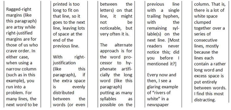
Right now, stop reading this essay, and go and look at samples of the following kinds of publication: a newspaper, a novel, a glossy magazine, and a textbook. Compare the sizes of their pages, the number of columns per page, and whether the right-hand edge of text lines up with the right margin (that is, lines are right-justified) or not (that is, the lines are set ragged-right). Now using that information, look at the following columns:
Avoiding Bad Line Breaks
Lines in the same paragraph are broken by the word processor at the space between consecutive words or after a real or artificially added hyphen. However, there are certain inter-word spaces where one should not break a line. For example, in the text "10 people", "year 2001", and "5th birthday", ordinarily, it is bad style to allow a line break to occur at any of the inter-word spaces. To ensure such a break doesn't happen, one must use a non-breaking space instead of a regular space.
Occasionally, one uses some text that contains one or more hyphens, neither of which one wants to be a candidate for a line break. For example, every legal US resident gets assigned a Social Security Number of the form 123-45-6789. Ordinarily, one would want to read this number as a whole item, all on the same line. To ensure this, one must use a non-breaking hyphen instead of a regular hyphen.
It is quite common to end a paragraph with a word that contains three or fewer letters. In such cases, it is also a good idea to precede such a word with a non-breaking space, to avoid that short final word's being on a line on its own (that is, being an orphan).
Avoiding Bad Page Breaks
According to Wikipedia, "In typesetting, widows and orphans are words or short lines at the beginning or end of a paragraph, which are left dangling at the top or bottom of a column, separated from the rest of the paragraph."
Personally, I think that orphans are more distracting than are widows. In any event, both should be avoided as much as possible. Check your word processor's widow and orphan controls.
In general, word processors treat text as a set of paragraphs, with headings and subheadings also being paragraphs, but set a bit differently. In this section, I have used the heading "Avoiding Bad Page Breaks". It would be bad form to have a page break occur between that heading and the following paragraph. Of course, as one edits a document over time, the addition and removal of text often causes page breaks to occur in different places. Rather than hoping to notice bad page breaks and "fix" them manually, one should be able to format the heading using some sort of "keep with next paragraph" property, so a page break will never occur immediately after it.
All Those Fonts and Typefaces
Let a new user loose on a word processor and pretty soon, he'll probably have discovered the myriad of fonts, typefaces, and point sizes, and tried to use many of them in the same document. This definitely is one instance in which less is more. Have too many visual distractions and the reader will be looking at the form only!
In my early days of computer-generated text processing, my printers had only a fixed-width typewriter font, which made for less-than-interesting documents. [At the very beginning, I actually worked on a popular computer system whose character set did not even have lowercase letters!] The advent of laser printers really opened up the use of proportional fonts and character sets with large numbers of symbols, including Greek letters, subscripts, superscripts, common fractions, and so on.
Getting the Reader's Attention
There are a number of ways of emphasizing text; they include the following:
- Centering it across the column or page –
This is useful for titles and subtitles
and for setting poems and wedding invitations.
- Setting it in bold – Do this sparingly; too much of it is equivalent to shouting.
- Setting it in italic – This is used effectively for one or two words at a time, foreign words or phrases, or quotations.
- Setting it with underline – This really is a holdover from typewriter days when there was no alternative. Don't use it unless required by a style guideline.
- Setting it in bold and italic with underline – Okay, that would get my attention and you an F on your paper I am grading.
- Using a different typeface – This is most often used to distinguish between different levels of headings and regular text. [I use this approach a great deal to distinguish computer-programming keywords from their English counterparts.]
- Using a different point size – This is most often used to distinguish between different levels of headings and regular text.
- Indenting the left (and possibly the right) margin of paragraphs borrowed from some other source (such as a poem or quotation).
If you would not be forgotten
As soon as you are dead and rotten,
Either write things worth reading,
Or do things worth the writing.
Benjamin Franklin
Using the Right Form of Dash
Although standard keyboards usually provide only one kind of hyphen-minus key, other dash-like characters are useful and generally available. For example:
- The humble "-" – Use this for a hyphen. It can also be used as a minus sign, although a better alternative might be available if you want a minus sign to have the same width as a plus sign. [We already mentioned the non-breaking hyphen earlier.]
- An em dash – This dash has the width of the letter M in the current typeface/font. Use an em dash to insert an aside into a sentence, as in "He met Mary—a woman he'd dated many years earlier—on his way home from work." Some writers put a space either side of an em dash; I don't. Typically, a pair of em dashes is interchangeable with a pair of parentheses.
- An en dash – This dash has the width of the letter N in the current typeface/font. Use an en dash to separate the endpoints of a range, as in, "numbers 1–5" and "Monday–Friday". [Using an ordinary (that is, a breaking) hyphen might cause an unwanted line break before the end value of the range.]
By the way, if you find yourself adding artificial hyphenation manually, you are using your Word Processor as a Typewriter.
Setting Margins
Large documents have pages that are usually printed on both sides and bound, either along a vertical edge or along the top edge. This requires that care be taken setting the page margins, so that left-sided (verso) and right-sided (recto) pages accommodate the bound edge.
Headers and Footers
Although adding these is easy, all too often they are missing from documents. Note that the contents of verso and recto pages might vary, and that the first page of a chapter/section might differ from both verso and recto. For example, the first line(s) of a chapter will ordinarily have the chapter number and name set in some special manner, in which case, it would be distracting (not to mention redundant) to also have that same information on that page's header immediately above that line.
Then there is the question of page numbering and number position. In single-sided documents, page numbers are often right justified or centered at the bottom. In two-sided documents, page numbers are often justified at the outer margin or centered at the bottom, or justified at the outer margin at the top.
The inner margin of the footer is a good place to put a Copyright notice.
Adding Asides
Occasionally, it is useful to supplement the main text with information that might be useful, but which is not essential. Such additional text should be presented in such a way that it is obviously not as important as the main body. The most common ways of doing this involve putting the extra text in the following places:
- Inside parentheses or square brackets, right in the body of the main text
- Inside a footnote
- Inside an endnote
The latter two approaches allow longer asides without distracting the reader. And when reading such documents in their native electronic form, one can usually jump to the accompanying note by clicking on the note marker in the main text. [Some people, including me, dislike endnotes in printed documents, as they can be hard to find.]
Lists
A good word processor should support both numbered and bulleted lists, as well as lists nested within a list, at least up to three levels deep. Note that the more sophisticated systems will let you replace the bullet with any number of alternate symbols.
If you find yourself formatting lists manually, you are using your Word Processor as a Typewriter.
Tables
It is true that a picture can be worth a 1,000 words, and so too can a table. The main things to consider when creating a table are, as follows:
- Set column headings in some emphasized way (bold, italic, larger point size, for example). If there are multiple heading lines, set them differently, and maybe make the first line span all the columns. It can also be useful to shade headings in grey or some other color.
- If the final row is a summary or totals row, set it in a special way, perhaps like that for headers.
- For very long tables, request that headings be repeated at the top of each continued page.
- If the cells in any row contain more than a few lines of text, consider whether individual rows can be broken across page breaks or whether all the lines in row must be on the same page.
- Take care when choosing the alignment of the table, column headings, and cell contents.
If you find yourself formatting tables manually, you are using your Word Processor as a Typewriter.
Adding Temporary Notes
Larger documents may be written over days, weeks, or even months, in which case, the author might like to leave placeholders about details yet to be determined or items to be done. See if your word processor provides a comment-tracking facility such that you can display or hide comments, or move through the set of comments mechanically without having to scan the text a page at a time looking for them.
More Advanced Options
There are many other things one might consider when formatting a document. And while they can require some investment of time to learn, they add a more sophisticated look to one's documents. These include the following:
- Links – these allow the on-line reader to jump to web pages, to places within the same document (via bookmarks, a special case of which is a forward reference), and to other documents.
- Tracked changes – this facility allows the changes to a previous edition to be tracked, so a reader can see both the old and new versions allowing her to proof the changes.
- Automatically numbering of figures and examples
- Adding pictures or photos and optionally having text flow around them
- Adding front matter pages before the first chapter/section, with such pages having Roman page numbers
- Providing a Table of Contents
- Adding a cross-reference index
Conclusion
Never distribute a document (or an email, for that matter) without running it through a spelling checker, and if possible, a grammar checker. Assuming you have such tools, not using them is just downright lazy! I guarantee you that your credibility will suffer if the document contains obvious spelling and grammatical errors. [It truly is stunning how many native English speakers don't know when to use there vs. their and its vs. it's, for example. A good checker will detect such misuses. However, I doubt any checker is infallible; I override mine on a regular basis.]
A final word of warning: If you get too anal about document layout, you will spend much more time critiquing a document's layout than you do reading its content. And while that might be appropriate when proofing a highbrow literary article, it's inappropriate for documents having a short shelf life, such as newspapers and personal communications.
Happy publishing!